

The majority of consumers don’t understand how search engine results work, according to BrandVerity’s Online Consumer Search Trends 2020 study. 63% of consumers think that search engines categorize results by advertising spend or relevance, or they don’t know how the search engines work.
The study also found that nearly half of consumers felt misled by a site in the search results; a quarter of them reported feeling like they were “often” or “always” misled by a result. 25% also said that the page a search engine directs them to does not show them what they were looking for.
There may not be a whole lot to do in terms of educating consumers about how search engines work; however, there are some things businesses can do: meet consumers’ high expectations and improve user experience.
Larger, more established businesses typically have more resources, so it’s easier for them to meet those expectations and create a better user experience. Growing businesses may lack some of those resources, but that doesn’t mean they can’t do the same thing for their website in similar ways. Even the smallest change has the potential to make a big impact on your consumers.
Optimize Your Business’s Website for Multiple Devices
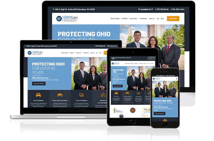
People use their phones nowadays for the majority of their consuming, including shopping and educational content. So, it only makes sense to have a website that runs smoothly on a smartphone, or any other mobile devices, for that matter.
When (re)designing a website, it’s critical to implement a mobile-first website with responsive design. Responsive design uses HTML and CSS to resize websites based on the device a site is being viewed on. It works for phones, tablets, and desktops of various resolutions.
Many web hosting and CMS platforms, such as WordPress, have features with built-in responsive design code. As an added bonus, a custom platform like Prismic offers CMS capabilities in a more efficient manner, giving businesses the ability to create mobile-first and fast websites, that will in turn boost SEO. It’s a win for everyone involved.
It’s 2020, and there shouldn’t be any more excuses for having a website that isn’t mobile-friendly.
OppGen Marking can help you design a beautiful, fast mobile-first website. Contact us to learn more about our web design services.
Use a Well-Designed Website Layout
It’s tempting to go all out and use every single cool feature as seen on other businesses’ websites. But here’s the thing: a busy-looking website can be too much to follow, resulting in higher bounce rates and less information retained from your consumers.
Don’t be afraid to use white space. It gives content breathing room and can help users find where to focus, or even to look for a product or page. That said, choose a focal point or two and use color or images to draw consumers’ attention. Think about size, too. The bigger an element, the more attention-grabbing it is.
Visit a website and take note of the first item you notice, then the second, third, and so one. Ask yourself what exactly drew you in. Was it color? An image? Text? Was it the biggest element on the page? Or the brightest-colored?
Choose Fonts, Colors, and Images Wisely
Fonts, colors, and images can make powerful focal points that direct consumers’ attention from one part of the page to the next.
Font
Paragraphs, please! Write paragraphs that are ideally no more than five sentences long. Longer content is good for SEO, but one giant blob of text is not good for readers’ eyes. You must balance form and function, with the rise of smartphones many readers are now trained to digest content in smaller blocks.
Be sure to make use of different heading sizes to divide up sections. It helps readers skim to find what they’re looking for. Headings are also useful for outlining content before writing it, making them a win-win! Typical site headings scale from H1 down to H5, with each heading being smaller than the previous to help set a visual hierarchy in the content. We recommend starting your H1 font size around 36px (pixels) to 50px. These headings will also factor into your search engine optimization strategy.
Text size is important and so is the readability of the font. Cursive scripts may look elegant, but they can be difficult to read. Save those fun fonts for headings or titles, or maybe even the business’s logo. Don’t use them for the main body text. For most websites, start with a body font size of 14px or 16px depending on body font style.
Use no more than two or three fonts on the same page and make sure it’s legible. Also, consider what’s being marketed on a website to help select the fonts that are most appropriate for the products. Advertising IT services or medical treatments with Comic Sans would interject more questions than provide credibility, but that font may be more acceptable for a preschool’s website. If you do not have an agency or creative person in-house, simply start with a neutral font such as Open Sans that can be industry agnostic.
OppGen can help you select fonts that are professional and fit your business’s brand.
Colors
Assuming your small business already has certain colors selected for its branding or logo, try to implement those colors on your website — but don’t overdo it.
Consider keeping the overall background white, gray, or black. Neutral colors go with everything and are less likely to clash with other colors.
Highlighting focal points with colored sections on top of that neutral background can really make your website pop.
Make sure that your font is readable. Black font on a black background is not accessible to readers.
Accessibility is something OppGen focuses on when building websites. Learn more about our web design process and goals today.
Images
Use professional-looking images — even stock photos. Yes, stock photos can appear too fake, but at least they look clean, crisp, and professional.
If possible, get a professional photo taken of you and your team. Seeing the “real faces” behind a small business makes it more personable and approachable. Even including small headshots, a very brief bio or quote (no more than a sentence or two), and contact information for each employee in the “about us” section helps.
Keep an Organized Navigation Menu
If your horizontal navigation bar at the top of the page contains more than five or six elements, it’s time to start consolidating, especially if it’s a dropdown menu.
Navigation bars typically include links to the following pages:
Homepage
Bring users back to where they started: your small business’s home page. You can simply use the word “home” or link your logo back to the home page.
What We Do/Solutions/Treatments/Products/Services Page
Essentially, this page features what your small business does. Pretty simple, right?
Resources Page
What extra resources could your small business offer? Product sheets or white papers? Client testimonials? Case studies? Blog posts? These are all items you can include in a dropdown menu, and in some cases, one or two elements can be separate elements on the navigation bar.
About Us Page
What’s your small business’s mission statement? What are your goals? Write a brief bio or quote with professional headshots for each employee. Include professionally taken photos of your business or products. You may want to include hiring information in this section, too, or at least as part of a dropdown menu.
Contact Us Page
Depending on what services or products you’re offering, this may be the most important page. It’s where users will take the next step and schedule an appointment or learn more about the service or product.
Create Authoritative Content
Show consumers that you know what you’re doing by creating in-depth content. Content comes in many forms: podcasts, videos, and blog posts. It’s easier than ever to start getting into any of these mediums.
Become the authority in your industry — or at least the expert in your neighborhood. Showing your knowledge doesn’t make you a know-it-all; it shows everyone else that you are a great resource who knows their business and industry.
Building up trust and meeting (and eventually, exceeding) consumers’ expectations takes time and effort, but that effort will pay off for you and your small business.
Website redesigns can be a lot to take on, especially while you’re trying to run and manage your business operations. This is why we specialize in helping growing businesses design and develop better website experiences built for their unique consumers.
Let the Experts at OppGen Create a Website that Meets Your Clients’ Expectations
Our websites won’t only meet your clients’ expectations. They exceed them. Contact OppGen today for more information.
