OppGen MarketingOppGen Marketing
  1. OppGen Marketing
  2. »
  3. Channel Insights
  4. »
  5. Page 3

By OppGen

Was Netflix’s Award Marketing Campaign a Success?

The Wall Street Journal reports that Netflix spent over $100 million in a marketing award campaign for some of its original movies. The same article finds that most of those funds went to campaigning for The Irishman and Marriage Story, both of which were Oscar contenders. 

Netflix’s head of original films, however, denies that the streaming service spent that much money on award marketing campaigns.


Is That a Lot of Money to Spend on an Award Marketing Campaign?

As The Wall Street Journal notes, traditional Oscar campaigns usually cost about $20 million for a single film. Given that Netflix’s films received 24 Oscar nominations this year for eight films (The Irishman, Marriage Story, The Two Popes, Klaus, I Lost My Body, American Factory, Life Overtakes Me, and The Edge of Democracy), the estimated $100 million does even things out. If the funds were distributed evenly, that would be about $12.5 million per film, which falls a little short of that typical $20 million.


What Did Netflix’s Award Marketing Campaign Entail?

According to The New York Times, Netflix took some non-conventional marketing routes, like sending film-related merchandise to reporters and film critics.

Netflix even went as far as to send members of the Broadcast Film Critics Association on free trips to meet actors and actresses and other people in the film industry at expensive locations and hotels — a move that upset traditional studios.

The streaming company also created a magazine, Queue, which included photos, articles, essays, and podcasts, to bolster the reputations of its nominated films.


Was Netflix’s Award Marketing Campaign a Success?

If Netflix’s goal was to receive more Oscar nominations than any other Hollywood studio this year (they did) and an impressive 34 Golden Globe nominations, then that could be considered a successful marketing campaign.

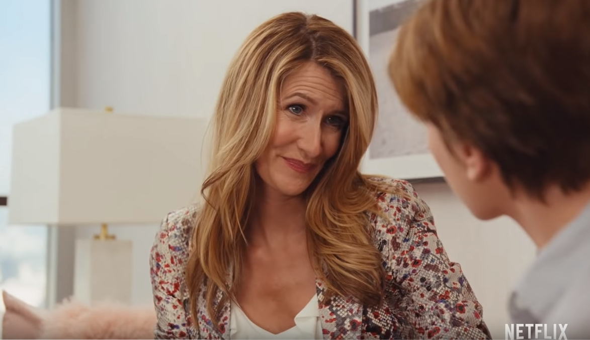
However, winning the nominated categories is the end goal, and Netflix fell short there. At the Golden Globes, Netflix walked away with two wins: Laura Dern for best supporting actress in Marriage Story and Olivia Coleman for best actress in The Crown. That would mean it cost Netflix roughly $50 million per win, assuming the reported campaign investment is correct. 

Out of its 24 Oscar nominations, Netflix also won two awards: Laura Dern for best supporting actress in Marriage Story and American Factory for best documentary.

All in all, Netflix’s awards marketing campaign was a mixed success.


Featured image: Screenshot via YouTube © Netflix

By OppGen

The Best Super Bowl LIV Commercials, According to OppGen

By now, you and your coworkers have probably spent all morning discussing and rewatching the latest Super Bowl LIV ads. As it turns out, your favorite commercials are all probably very different from their favorites. 

Maybe a coworker liked one that was more emotional. A different coworker found one commercial hilarious while another didn’t even crack a smile while watching it.

Even in a workspace that specializes in marketing might find itself divided over what the best commercial was the day after the Super Bowl. Case in point: OppGen’s employees all had very different opinions about which commercial was their favorite.


Alex Sheets, Digital Marketing Analyst

#BeforeAlexa (Amazon)


The one that made me laugh the most was the Ellen DeGeneres Amazon/Alexa commercial talking about having assistants named Alexa in different periods in history. It was well thought out and executed, and the ending was great.


Loretta (Google)

The one that made me feel something the most was the Google commercial with the old guy using Google to remind him of the great things about his wife. My grandma has Alzheimer’s, so it hit close to home and gives me chills every time I think about it.


Connor Potts, Digital Marketing Analyst

#SnickersFixtheWorld (Snickers)

My favorite was the Snickers commercial where they fed the Snickers bars to the earth because it hasn’t been a great year so far.


Tribute (Planters)

I don’t think it is a good commercial; I just think from a campaign standpoint, it is generating a lot of buzz, especially when #RIPMrNut happened.


Zain Khan, Director of Operations

Tom Brady’s Big Announcement (Hulu)

My favorite Super Bowl commercial this year was the Hulu commercial featuring Tom Brady. Every year, over the last at least 6 or 7 years, there has always been a debate about Tom Brady retiring from football because he is “too old” at age 42. I genuinely thought he was announcing his retirement, but he was really talking about TV dying rather than him retiring.

The relevance, simplicity, and timing of it couldn’t have been more perfect for me. Hulu took the greatest-ever to play the sport, made it seem like he was announcing his retirement, which could potentially be a bigger moment than the Super Bowl itself, and in that context, made a point about TV dying. That is creative simplicity, which was refreshing to see.


Cody Palmer, Senior Analyst

Love Takes Action (New York Life)

One that I thought was well-made and remember was New York Life. I liked how they took one word (love) and broke it down into the four Greek words for love.


Van Le, Graphic Designer

SodaStream Discovers Water on Mars (SodaStream)

I had a few shots forced on me, so I really didn’t remember much of the ads. I just remember the Mars and soda water one because it was a bit ridiculous. The rest, not so much.


Alex Francis, Developer

Inside Post’s Brain (Budweiser)

>

Because of the humor.


Sydney Schulte, Content Writer

Heroes (Toyota)

OK, I’ll admit: I didn’t watch the Super Bowl. But I did watch just about every 2020 Super Bowl commercial for this blog post, so I think it’d be a mistake to not contribute. As a self-proclaimed geek who’s spent an unhealthy amount of time mourning the losses of characters in TV shows and movies who sacrifice themselves so everyone else can live, I really appreciated Toyota’s commercial. It poked fun at that overdone valiant sacrifice trope with the most unlikely hero of all: Cobie Smulders behind the wheel of a Toyota Highlander — the ultimate soccer mom car.


Alonzo Foreman, Partner

Groundhog Day (Jeep)

My top Super Bowl ad this year was Groundhog Day from Jeep. For me, it connected emotionally seeing Bill Murray reprise his role as Phil from the iconic film, but with a modern-day twist. It does a fantastic job of reinforcing the company’s value proposition while still offering an experience that’s light-hearted and fun. And most importantly, I remembered the product and the brand!


And the award for the best Super Bowl LIV commercial goes to…

When it really comes down to it, it may be impossible to determine the best commercial. That hasn’t stopped USA Today from running its Super Bowl Ad Meter, which ranks what it considers to be the best Super Bowl commercial. Ad Meter scores ads using the average of a panel’s rating. This year’s top-ranked commercial? Jeep’s Groundhog Day.


Featured image: Screenshot via YouTube © Jeep

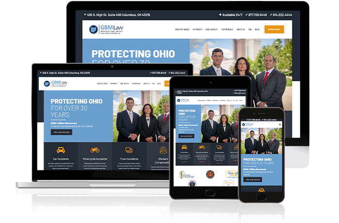
GBM Law, personal injury law firm, website displayed on multiple devices and channels

By OppGen

Creating A Website That Meets Consumers’ Expectations 

The majority of consumers don’t understand how search engine results work, according to BrandVerity’s Online Consumer Search Trends 2020 study. 63% of consumers think that search engines categorize results by advertising spend or relevance, or they don’t know how the search engines work.

The study also found that nearly half of consumers felt misled by a site in the search results; a quarter of them reported feeling like they were “often” or “always” misled by a result. 25% also said that the page a search engine directs them to does not show them what they were looking for.

There may not be a whole lot to do in terms of educating consumers about how search engines work; however, there are some things businesses can do: meet consumers’ high expectations and improve user experience. 

Larger, more established businesses typically have more resources, so it’s easier for them to meet those expectations and create a better user experience. Growing businesses may lack some of those resources, but that doesn’t mean they can’t do the same thing for their website in similar ways. Even the smallest change has the potential to make a big impact on your consumers.


Optimize Your Business’s Website for Multiple Devices

People use their phones nowadays for the majority of their consuming, including shopping and educational content. So, it only makes sense to have a website that runs smoothly on a smartphone, or any other mobile devices, for that matter.

When (re)designing a website, it’s critical to implement a mobile-first website with responsive design. Responsive design uses HTML and CSS to resize websites based on the device a site is being viewed on. It works for phones, tablets, and desktops of various resolutions.

Many web hosting and CMS platforms, such as WordPress, have features with built-in responsive design code. As an added bonus, a custom platform like Prismic offers CMS capabilities in a more efficient manner, giving businesses the ability to create mobile-first and fast websites, that will in turn boost SEO. It’s a win for everyone involved.

It’s 2020, and there shouldn’t be any more excuses for having a website that isn’t mobile-friendly.

OppGen Marking can help you design a beautiful, fast mobile-first website. Contact us to learn more about our web design services.


Use a Well-Designed Website Layout

It’s tempting to go all out and use every single cool feature as seen on other businesses’ websites. But here’s the thing: a busy-looking website can be too much to follow, resulting in higher bounce rates and less information retained from your consumers.

Don’t be afraid to use white space. It gives content breathing room and can help users find where to focus, or even to look for a product or page. That said, choose a focal point or two and use color or images to draw consumers’ attention. Think about size, too. The bigger an element, the more attention-grabbing it is.

Visit a website and take note of the first item you notice, then the second, third, and so one. Ask yourself what exactly drew you in. Was it color? An image? Text? Was it the biggest element on the page? Or the brightest-colored?


Choose Fonts, Colors, and Images Wisely

Fonts, colors, and images can make powerful focal points that direct consumers’ attention from one part of the page to the next. 


Font

Paragraphs, please! Write paragraphs that are ideally no more than five sentences long. Longer content is good for SEO, but one giant blob of text is not good for readers’ eyes. You must balance form and function, with the rise of smartphones many readers are now trained to digest content in smaller blocks.

Be sure to make use of different heading sizes to divide up sections. It helps readers skim to find what they’re looking for. Headings are also useful for outlining content before writing it, making them a win-win! Typical site headings scale from H1 down to H5, with each heading being smaller than the previous to help set a visual hierarchy in the content. We recommend starting your H1 font size around 36px (pixels) to 50px. These headings will also factor into your search engine optimization strategy. 

Text size is important and so is the readability of the font. Cursive scripts may look elegant, but they can be difficult to read. Save those fun fonts for headings or titles, or maybe even the business’s logo. Don’t use them for the main body text. For most websites, start with a body font size of 14px or 16px depending on body font style. 

Use no more than two or three fonts on the same page and make sure it’s legible. Also, consider what’s being marketed on a website to help select the fonts that are most appropriate for the products. Advertising IT services or medical treatments with Comic Sans would interject more questions than provide credibility, but that font may be more acceptable for a preschool’s website. If you do not have an agency or creative person in-house, simply start with a neutral font such as Open Sans that can be industry agnostic.

OppGen can help you select fonts that are professional and fit your business’s brand.


Colors

Assuming your small business already has certain colors selected for its branding or logo, try to implement those colors on your website — but don’t overdo it.

Consider keeping the overall background white, gray, or black. Neutral colors go with everything and are less likely to clash with other colors.

Highlighting focal points with colored sections on top of that neutral background can really make your website pop.

Make sure that your font is readable. Black font on a black background is not accessible to readers.

Accessibility is something OppGen focuses on when building websites. Learn more about our web design process and goals today.


Images

Use professional-looking images — even stock photos. Yes, stock photos can appear too fake, but at least they look clean, crisp, and professional.

If possible, get a professional photo taken of you and your team. Seeing the “real faces” behind a small business makes it more personable and approachable. Even including small headshots, a very brief bio or quote (no more than a sentence or two), and contact information for each employee in the “about us” section helps.


Keep an Organized Navigation Menu

If your horizontal navigation bar at the top of the page contains more than five or six elements, it’s time to start consolidating, especially if it’s a dropdown menu.

Navigation bars typically include links to the following pages:


Homepage

Bring users back to where they started: your small business’s home page. You can simply use the word “home” or link your logo back to the home page.


What We Do/Solutions/Treatments/Products/Services Page

Essentially, this page features what your small business does. Pretty simple, right?


Resources Page

What extra resources could your small business offer? Product sheets or white papers? Client testimonials? Case studies? Blog posts? These are all items you can include in a dropdown menu, and in some cases, one or two elements can be separate elements on the navigation bar.


About Us Page

What’s your small business’s mission statement? What are your goals? Write a brief bio or quote with professional headshots for each employee. Include professionally taken photos of your business or products. You may want to include hiring information in this section, too, or at least as part of a dropdown menu.


Contact Us Page

Depending on what services or products you’re offering, this may be the most important page. It’s where users will take the next step and schedule an appointment or learn more about the service or product.


Create Authoritative Content

Show consumers that you know what you’re doing by creating in-depth content. Content comes in many forms: podcasts, videos, and blog posts. It’s easier than ever to start getting into any of these mediums.

Become the authority in your industry — or at least the expert in your neighborhood. Showing your knowledge doesn’t make you a know-it-all; it shows everyone else that you are a great resource who knows their business and industry.

Building up trust and meeting (and eventually, exceeding) consumers’ expectations takes time and effort, but that effort will pay off for you and your small business.

Website redesigns can be a lot to take on, especially while you’re trying to run and manage your business operations. This is why we specialize in helping growing businesses design and develop better website experiences built for their unique consumers.


Let the Experts at OppGen Create a Website that Meets Your Clients’ Expectations

Our websites won’t only meet your clients’ expectations. They exceed them. Contact OppGen today for more information.

By OppGen

Top 3 Advertising Fails of 2019

The new year comes with a new start. It’s a time to look toward the future, to make goals and resolutions of how to grow and improve in every aspect of life.

It’s also a time of reflection. Some may look back on 2019 feeling like they conquered the year.

Others, however, might reflect on where they failed. Failures can be turned into learning experiences, and in a few rare cases, successes. This is something that can be seen in advertising campaigns, and 2019 was full of marketing fails.

Here are some of the most memorable advertising fails of 2019:


1. Chase Bank’s #MotivationMonday Tweet

Chase Bank’s well-meaning advice didn’t exactly go over well with Twitter users in this now-deleted tweet.

Why It Was an Advertising Fail

Chase Bank’s tweet was tone-deaf and ignored the financial realities many people face. Someone’s bank account might be low on funds for more serious reasons, such as paying for a surprise medical bill, as opposed to getting coffee at Starbucks every morning.

This tweet showed a lack of awareness and understanding of consumers’ real financial problems, which is not a great look for a bank — especially a huge one like Chase. It suggests that Chase is out of touch with reality and its customers.


What We’ve Learned

Marketing campaigns sometimes fall short when it comes to sensitivity and awareness. It’s likely that in most cases, it’s due to ignorance or a lack of diversity in the room or test audience. As the saying goes, ignorance is bliss, but ignorance is still not an excuse for racist or sexist marketing campaigns, such as Dove’s 2017 social media ads that featured black women turning white after using their products.

In these cases, the brands reach out and publicly apologize and try to do better, though some, like Dolce & Gabbana, fail to improve.

When faced with an ad done in poor taste, the apology is important, but it’s even more important to ensure that there won’t be another one like it. When testing marketing campaigns, make sure the test audience is not homogeneous. The more feedback a brand has, the better. 


2. Peloton Selfie Commercial

While it’s not as rude as Chase Bank’s tweet, the Peloton selfie commercial succeeded in simultaneously alienating and uniting viewers in hating it — and that’s quite a feat.

Why It Was an Advertising Fail

A lot of the hatred for this commercial comes from how out of touch it is. Relatively few people would be excited to be gifted a stationary bike, for starters. Then there’s also the cost of the Peloton to consider, which starts at $2,245 — and that doesn’t factor in the classes that cost $39 per month.

Some viewers were irked that the husband gifted his already-fit wife this gift when she clearly doesn’t need to lose any weight or get in shape. She appears to look the same as she did at the start of the commercial. If people really did want to change their lives with a Peloton, it probably wouldn’t be to lose 4 pounds in a year, as the woman in the ad proudly announces.

Others said this commercial was sexist, particularly with the husband gifting this to his wife (a rude gesture), but it was also sexist when it came down to targeting an audience. A lot of men buy Pelotons, but the husband didn’t use it. The woman is the main focus of this commercial. Peloton failed to reach a good portion of its consumer base with that decision alone.

More tech-savvy viewers took issue with how social media was integrated into the ad. Playing around with social media-style videos can be done well, but this wasn’t the case. People pointed out that parts of the commercial could easily be cut up and thrown into an Instagram ad. 

If those things didn’t kill the commercial, the complete lack of common sense did. The ad ran nationally with no contextual targeting, the woman sent videos to the man she lives with, and she put the exercise bike next to the kitchen island.


What We’ve Learned

Peloton is well-known for being out of touch with the masses. In a CNN Business interview, Peloton CEO John Foley said the bike is “crazy affordable,” which is a pretty bold if not inaccurate statement.

It’s important to keep the target audience in mind, and if Peloton was trying to target the lower and middle classes, then it definitely failed in that regard.

However, Peloton could be using its outlandish expectations to garner attention, and if that’s the case, this commercial could be viewed as a success… but considering the fact that Peloton’s stock dropped about 9% after the commercial aired, it’s probably more of a failure than a success.


3. Tesla’s Cybertruck Reveal

Elon Musk’s Twitter account might be a grand example of what as a company CEO should not be sharing (i.e., the SEC fining Musk $20 million for tweeting about Tesla stocks potentially going private), but the Tesla Cybertruck reveal actually might be one of the more effective marketing failures. 

Why It Was an Advertising Fail

For a car that was marketed as bulletproof, the Cybertruck turned out to be lacking in that department.

To prove the bulletproof claim, Tesla designer Franz von Holzhausen threw a steel ball against the car’s window. Immediately, spider-web cracks spread from the point of impact.

Musk said that the Cybertruck had been hit with a sledgehammer before the presentation, which is probably why the steel ball shattered the window.

What We’ve Learned

A failure can be turned into a success, and the Tesla Cybertruck is one of those successes. Part of that success is probably due to the appearance of the Cybertruck. It’s also the first electric pick-up truck, and firsts can do very well.

People poking fun at the Cybertruck’s polygon-esque body and the smashing reveal on Twitter and other social media sites made for great free publicity. Bad publicity is still publicity, and sometimes that’s all a brand needs in order for a marketing campaign to take off. (And 250,000 Cybertruck pre-orders certainly don’t hurt, either.)


The 3 Big Lessons We Can Learn from These Advertising Fails Are:

  1. Diversify test audiences and reviewing for offensive content 
  2. Know your audience
  3. Try to spin a failure into something people will be talking about for days

By OppGen

6/20 – This Week In Digital Advertising

This Week In Digital Advertising

Facebook Shares Cryptocurrency Plans

Facebook announced on Tuesday a new subsidiary called Calibra which provides financial services. The first product Calibra will introduce is a digital wallet for Libra, a new global currency powered by blockchain technology.

The idea is to make transferring money as easy as sending a message on Facebook. Calibra will allow users to send Libra to anyone with a smartphone. For many people financial services are hard to come by. The company is looking to tackle this challenge with Libra. Facebook also said they hope to add more features in the future such as billing payments or even getting a cup of coffee with Libra.

Even though they struggle with the handling of user data and have seen backlash about possible antitrust law violations the company wants to bring cryptocurrency to the mainstream.

Facebook says they will be working with experts to ensure the product is safe and private. They will use the same verification and anti-fraud processes used by banks and credit cards, along with automated systems to monitor activity and detect fraud.

Facebook has 2.7 billion users which could help with user adoption and acceptance overall. The company is looking to create a marketplace for small business as well, in the hopes that they will spend more on advertising on the platform in the future.

The wallet will be available in WhatsApp, Messenger, and a standalone app. Timeline for release is 2020, as they continue development. Having wide availability will help bridge the gap and make cryptocurrency not as intimidating for active Facebook users.  

LinkedIn Announces Video Messaging, Photo Tagging, and other features

LinkedIn has added several new features. The social media platform continues to evolve with these changes in an effort to keep engagement numbers up. Microsoft has reported the platform has seen “record numbers” in engagement this year. LinkedIn has outlined some of the new features.

A photo-tagging feature has been launched to all users. In a blog post, the company outlined states “The world seems smaller and your community a little tighter when you let people know who is who.” Now when you see an image of a co-worker or someone you recognize, you can tag them in the image.

There is also a new feature that allows users to record video clips and send them in a message. “Millions of members have posted videos and shared them with their connections or in groups: sharing ideas, experiences, or simply a view into their working life. Now you can do the same in messaging, too.”

LinkedIn will keep messaging and posting availability within that app. This will keep things more organized and allow users to better manage profiles.

By clicking on your profile picture on mobile and on the right side of the feed on a desktop users can see hashtags they follow and view all groups they are apart of.

As LinkedIn continue to add more features to build engagement we will continue watching how this affects user interaction with ads on the platform. Video especially will continue to gain traction and continue to drive users.

1 2 3 4 5 7
Skip to content
Was Netflix’s Award Marketing Campaign a Success?
The Best Super Bowl LIV Commercials, According to OppGen
GBM Law, personal injury law firm, website displayed on multiple devices and channels
Creating A Website That Meets Consumers’ Expectations 
Top 3 Advertising Fails of 2019
6/20 – This Week In Digital Advertising